
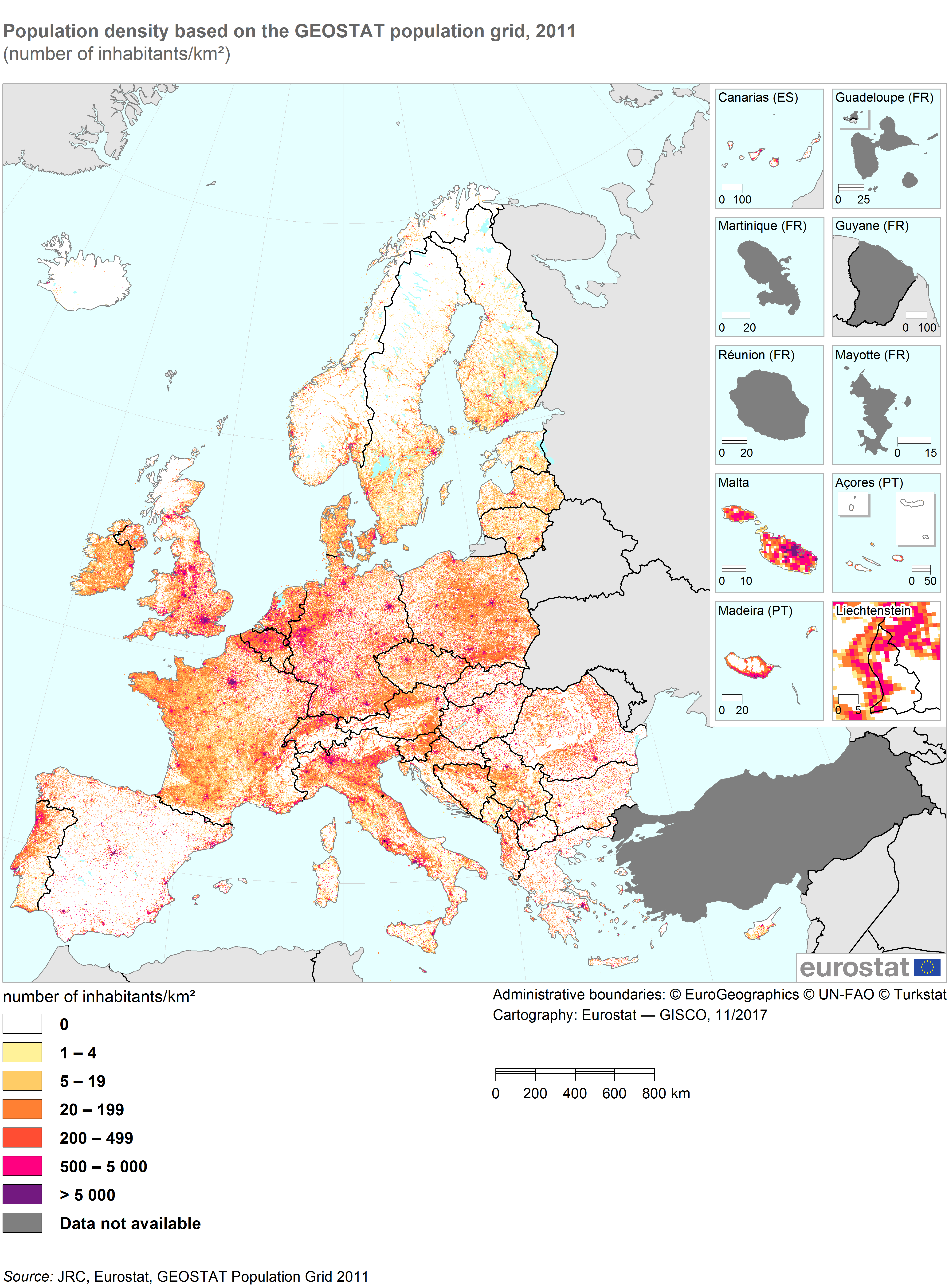
O mundo precisa urgente é de gete no campo. O distributismo defende que as pessoas devem ter suas próprias propriedades, em geral isso significa mais gente no campo. E o mundo precisa mesmo disso. Vejam os mapas abaixo, do World Economic Forum.
Italy
Based on data from NASA/SEDAC, this map shows how Italy’s population is distributed – half lives in the densely-packed purple areas (8% of the land), half lives in the sparse grey areas (92% of the land).

Image: metrocosm
The map is the latest addition to a long-running string of population maps tweeted out by Conrad Hackett, a Pew Research demographer with a very interesting and very popular Twitter feed. The maps show how and where people are concentrated in different regions of world, including contributions from some great data visualizers as well as a few of my own.
It’s no surprise that people are not evenly spread out across the Earth. But seeing the population concentrations mapped out visually can be quite striking.
The world
On a global level, 50% of the world’s population lives in just 1% of its land.

Image: metrocosm
The map below shows the world’s population density from another perspective. Only 5% of the world lives in the entire blue area. For comparison, the same number of people live in the small red area (bonus points if you can name the two countries it covers).

Image: metrocosm
Australia
Australia may be the country with the most extreme population concentration in the world. Physically, it is about the same size as the United States. But as this map by reddit user jnd-au shows, half of Australia’s 23 million people live in just a few densely packed specs.

Image: jnd-au
United States
This map of the United States was made by Jishai Evers of dadaviz, a site that put out some great data visualizations before being acquired by Vocativ late last year.
Of the United States’ 3,142 counties, just 144 account for half of the population.

Image: Jishai Evers, dadaviz.com
Spain

Image: metrocosm
France
This map of France comes by way of Mathieu Dehlinger of francetvinfo. It shows not only the 50%/50% population split, but the full range of possible breakdowns.

Image: Mathieu Dehlinger, francetvinfo
North Africa
Unsurprisingly, the Sahara Desert has one of the lowest population densities on the planet. Nearly half the population of North Africa lives along the banks of the Nile River.

Image: metrocosm
Turkey
This map by Aron Strandberg shows the population concentration of Turkey. 50% of the population lives in the black regions, 50% lives in the yellow regions.

Image: @aronstrandberg
Canada
The 49th parallel is traditionally thought of as the border between the US and Canada. Oddly, most Canadians live far below it. 50% of Canada’s populationlives in this red area, which is at about the same latitude as Oregon.

Image: metrocosm
You can find these and many other population density maps on Conrad’s Twitter feed. If you have any suggestions for other parts of the world whose population would be interesting to see visualized like the maps above, feel free to share your thoughts.